Three things I know about Graphs :
A bar graph is the best thing to use when you are comparing. It's more easier to understand.
Line Graph : can be used for showing data certain amounts of time.
Pictograph : are best for comparing data , and could be easily counted by using symbols.
What I Learned :
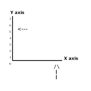
When you want to make the graph misleading you could put brakes.
PLEASE LEAVE A COMMENT !
Showing posts with label graphing. Show all posts
Showing posts with label graphing. Show all posts
Wednesday, October 14, 2009
Scribepost 6,September 24,2009,Larrisa's Scribepost
Legend:
blue : questions
black : answers

What information does each graph provide?
Each graph provides the height of the plant for four weeks. The
line graph shows you the height of when each plant grows. The picto-graph
shows the height each plant using pictures. ( one leaf represents 20)
Between which two weeks did the plant grow at the same rate ?
The plant grew at the same rate as week 2 and 3 .
Between which two weeks did the plant change in the most in height ? Which graph
shows more clearly ?
Week 3 and 4 the plant changed the most in height. Both graph shows the growth clearly.
Describe one advantage and one disadvantage of using each graph.
The advantage of a line graph is that it shows the data more clearly and the disadvantage is that you can't find the exact amount of what they are representing.
The advantage of a Pictograph is that it shows what they are representing more clearly and the disadvantage is that it can't show the exact amount.
I hope you like my scribepost ! , please leave a comment.
Tuesday, October 13, 2009
Mary Jane's Scribepost for Question # 16, October 13, 2009

Question # 16:
a) What ice cream store do you believe developed this graph? Explain.
I believe that the Cool Flavours ice cream store developed this graph because the size of it is bigger than the other which draws you more into it.
b) How is this graph misleading?
The size of the ice cream picture representing each store is not the same. Because of this, it creates the illusion that the Cool Flavours ice cream store is more successful than the other when really the only difference is $200 000.
Bob -Marielle817
Three things i know about graphing are... :
- how to use a linegraph
- how to use a bargraph
- how to use a axis break
One thing that can help me improve on my test is learing how to use a circle graph and fiding out the percents of each peice of the circle out of 100 % .
- how to use a linegraph
- how to use a bargraph
- how to use a axis break
One thing that can help me improve on my test is learing how to use a circle graph and fiding out the percents of each peice of the circle out of 100 % .
Monday, October 12, 2009
elissa's BOB,october.12
3 Things I learned about graphing are,
1 .Bargraphs are best for comparing data across categories.
2. Double Bargraph are best for comparing two different sets of data across catergories.
1 .Bargraphs are best for comparing data across categories.
2. Double Bargraph are best for comparing two different sets of data across catergories.


Wednesday, October 7, 2009
Scribepost for Sept. 30
Question # 5
A) How many times taller does the bar for B appear than the bar for A?
B is about 3x bigger than A.
B) How many times as great are the votes in bar B than votes in A?
B is really only 2x bigger than A, but the break in the y axis makes it look misleading.
C)What conlusion does the graph suggest about the election results?
The conclusion of the graph means that whoever made it wanted B to look like it beat A by more than it really did.
D)How could the graph be redrawn to make the data more clear?
It could be made more clear by taking out the axis break.
Sorry for this post being so late comment if you like.
Gilberts BOB on graphing
Three thing I know about graphing.
1) Bar graphs are best for comparing Data across categories.
2) Pictographs are best for comparing data that can be easily counted and represented using symbols.
3) Circle graph are best for comparing categories to the whole using percentage.
Sorry if this is so short but at least I did one.
Please comment!
Tuesday, October 6, 2009
Brayden's BOB 06/10/09
3 things I know about graphing :
1) Line graphs aren't as good as bar graphs because they don't have the area that a bar graph does.
2) You have to label your graph. ( title, x-axis, and y-axis)
3) There are many types of graphs
One thing I could improve on :
The one thing I think I could've improved on was making my second graph more misleading.
COMMENT!
Justine's BOB
Three things i know about graphs :
1. there useful in everyday life
2. you can talk about anything that is with numbers and put it in a graph
3. you always have to have a title , intervals , and labels on your graph .
To improve , I can hand assignments in on time and do my homework .
1. there useful in everyday life
2. you can talk about anything that is with numbers and put it in a graph
3. you always have to have a title , intervals , and labels on your graph .
To improve , I can hand assignments in on time and do my homework .
Noels's BOB on graphing
Things I know about graphing
1) Line graphs are best for showing changes in data over time.
2) Double bar graphs are best for comparing two sets of data across categories.
3) Bar graphs are best for comparing data.
I could've finished my assesment on time, coloured bars, label the graphs, and wrote a concluson.
1) Line graphs are best for showing changes in data over time.
2) Double bar graphs are best for comparing two sets of data across categories.
3) Bar graphs are best for comparing data.
I could've finished my assesment on time, coloured bars, label the graphs, and wrote a concluson.
Ammorn's BOB Scribepost
Three things I know about graphing:
1- A bar graph is the best graph to use when you're comparing data.
2-Line graphs are best for showing increases and decreases, and changes in data over time.
3- Distorting the y-axis can change how the graph looks and make one piece of information look better than the other.
What I learned:
I learned that you could put a break in the y-axis to make the graph misleading.
PLEASE LEAVE A COMMENT (:
BOB for October 6, 2009
3 things I learned about graphing:
 1. Different types of graphs:
Bar graph - This graph is best for comparing data across categories
Double Bar Graph - This graph is best for comparing two sets of data across categories
Circle Graph - This is best for comparing categories to the whole using percents
Line Graph - This is best for showing changes in data over time
Pictograph - This is best for comparing data that can be easily counted and represented using symbols
 2. What needs to be on a graph:
Title - varies on what data you're graphing
Labels - a graph needs to have a label on the x and y axis
Intervals - intervals need to be consistent
x and y axis - x-axis: horizontal line, y-axis: vertical line
Origin - the starting point or also known as the number 0
 3. Misrepresenting Data:
Distorting the size - ex. make the size of the bars on a bar graph bigger than the others
Distorting the visual - ex. make the number on a pie graph bigger than the other numbers or by using a bright color so it stands out.
Distorting the scale - ex. put an axis break on graph
What I need to improve on for the assessment:
On my assessment, I need to improve on putting a prediction with my conclusion and explaining a trend.
Argie's BOB on graphing
3 things I know about graphing
1) Pictographs are best for comparing data that can be easily counted represented by using symbols.
2) Bargraphs are best for comparing data across categories.
3) Circlegraphs are best for comparing categories to the whole using percents.
I could've put colour in my bars, labels on my misleading graph, and a better
Connors BOB scribepost
Three things I know about graphing,
Pictographs:
They can be misleading if the images are bigger or smaller.
Bar Graphs:
They can be used to compare different amounts of data in exact amounts.
Line Graphs:
They can be used for showing data over certain amounts of time.
Something that I would of liked to know for the test is how to mislead people by changing the size or space of a bar on a bar graph.
Thanks for reading my scribepost please leave any comments you wish.
Ferrari's BOB
Three things i know about graphs:
- all graphs need a title, labels, and intervals
- there are many types of graphs
(eg. line graph, bar graph, circle graph, pictograph , etc. )
- you can distort a graph , and it will still be correct (misrepresenting )
To improve , I could have spent way more time on this assesment , i could have shaded in the bars , wrote a paragraph , finished the misleading graph , etc .
Thanks for reading my post , COMMENT (:
Brendan's BOB
3 things Brendan knows about graphing.
- There are many different types of graphs.
- All graphs show data.
- You can make the graph look different and it will still be correct.
I know that giving more conclusions and expanding my number order will improve my test.
BOB 2
The mistakes I made on my test are not converting ratios. For the questions that I got wrong, examples of wrong answers were answers that were way off. My mistake was picking the answers that were way off. I will remember what to do in future test because I will take my time.
1. A picture frame has a width to length ratio of 5:7. If the width of the photo is 9 cm, the length of the photo is ?
2. Eric is able to stop 85% of the shots on goal. If he faces 27 shots on goal, how many goals would he likely be scored on him ?
How did you solve these questions ?
Ralph's BOB October 6
What do I know about graphing?


1. I know that there is an x and a y axis on a bar graph.
2. I know that the intervals on the y axis must stay the same all the way up.

3. I know that there are several different types of graphs
What did I miss on my assessment?
1. One thing I did wrong on the assessment that I should have done was that I was also suppose to put a T - Chart when I was suppose to organize data.
2. Another thing I was suppose to do was to also put trends
3. The final things I had to do was put was two ways why distorted a number and two ways
how I distorted a number.
Thanks for reading my post ! Please leave a comment !
BOB for Oct. 6
For today's scribe, I will be telling you three things I know about graphing!
These are the three things I know about graphing:
1) Different types of graphs.
There are a lot of many different types of graphs that can be used to show a set of data.
Examples are bar graphs, double bar graphs, circle graphs, line graphs and picto graphs.
People may misinterpret the data and draw false conclusions when graphs are misleading.
Misleading features of graphs may include the following:


3) Advantages and disadvantages.
Every type of graph has its own advantage and disadvantage of showing a set of data.
Bar graph & double bar graphs
Advantages
Advantages
Advantages
Advantages
I can improve on explaining how graphs could be misleading and also being able to write at least a paragraph about a graph.
These are the three things I know about graphing:
1) Different types of graphs.
There are a lot of many different types of graphs that can be used to show a set of data.
Examples are bar graphs, double bar graphs, circle graphs, line graphs and picto graphs.
- Bar graphs are best for comparing a set of data.
- Double bar graphs are best for comparing two sets of data.
- Circle bar graphs are best for comparing categories by using percent.
- Line graphs are best for showing changes in a set of data.
- Picto graphs are best for comparing data that can be counted and represent by using pictures.
People may misinterpret the data and draw false conclusions when graphs are misleading.
Misleading features of graphs may include the following:
- Distorting scales.

- Distorting the information by using visuals of different sizes.

3) Advantages and disadvantages.
Every type of graph has its own advantage and disadvantage of showing a set of data.
Bar graph & double bar graphs
Advantages
- Excellent use for comparing one or two sets of data.
- Easy to read and understand.
- Can be tempting to compare too many things, the graph becomes difficult to understand.
- Limited space for labeling with vertical bar graphs.
Advantages
- Shows total percent for each category.
- Visually appealing.
- Hard to compare two sets of data.
- No exact numerical data.
Advantages
- Can easily compare continuous sets of data.
- Shows the increase and decrease of a data set.
- Use only with continuous data.
Advantages
- Easy to read.
- It can easily handle large sets of data using icons.
- Best for only 2-6 categories.
- Icons must be correct in size.
I can improve on explaining how graphs could be misleading and also being able to write at least a paragraph about a graph.
BOB for October 6, 2009
BOB for Graphing
3 things I learned about graphing are:1) The different types of graphs and what they are best for:
Bar Graph

-bar graphs are best for comparing data across categories
Double Bar Graph
- double b
 ar graphs are best for comparing two sets of data across categories
Circle Graph
- circle graphs are b
 est for comparing categories to the whole using percents
- the sum of the percents in a circle graph is 100%
Line Graph
- line graphs are bes
 t for showing changes in data over time
Pictograph
- pictographs are be
 st for comparing data that can be easily counted and represented using symbols
2) The correct terms:

3) To distort a graph

- use an axis break
 - change the sizes
 - make one stick out using colour
Something I need to improve on, that I didn't do on the assessment is that I need to explain the trend and make a prediction with the conclusion from the graph.
April's scribepost for Oct.6,2009 BOB
3 Things I Know About Graphing.
#1:Different types of Graphs:
-Bar Graph
-Line Graph
-Pictograph
-Circle Graph
-Double Bar Graph
Bar Graphs are best for comparing data across categories.
Line Graphs are best for showing changes in data overtime.

Pictographs are best for comparing data that can be easily counted and represented using symbols.

Circle Graphs are best for comparing categories to the whole using percents in a circle graph is 100 %.

Double Bar Graphs are best for comparing two sets of data.

#2:Misrepresenting the data.
Distorting the scale- make some scales wider or slimmer.
Putting breaks and changing the intervals- it makes the data look closer or farther away from each other.
Changing the colour of the bars- makes people pay attention to that part.
#3:Disadvantages.
Bar Graph- If the intervals are spread out too much, it would be to hard to represent the data.
Line Graph- You don't know where the dot exactly is, unless you are going up by ones.
Circle Graph- It doesn't show the exact numbers, because it uses percents.
Pictograph- It is not exact. And you don't know what half is.
What I need to improve on:
I need to improve on explaining my graph more precisely. I need to make a longer paragraph, a better description and I need to put a trend, or a prediction.
#1:Different types of Graphs:
-Bar Graph
-Line Graph
-Pictograph
-Circle Graph
-Double Bar Graph
Bar Graphs are best for comparing data across categories.

Line Graphs are best for showing changes in data overtime.

Pictographs are best for comparing data that can be easily counted and represented using symbols.

Circle Graphs are best for comparing categories to the whole using percents in a circle graph is 100 %.

Double Bar Graphs are best for comparing two sets of data.

#2:Misrepresenting the data.
Distorting the scale- make some scales wider or slimmer.
Putting breaks and changing the intervals- it makes the data look closer or farther away from each other.
Changing the colour of the bars- makes people pay attention to that part.
#3:Disadvantages.
Bar Graph- If the intervals are spread out too much, it would be to hard to represent the data.
Line Graph- You don't know where the dot exactly is, unless you are going up by ones.
Circle Graph- It doesn't show the exact numbers, because it uses percents.
Pictograph- It is not exact. And you don't know what half is.
What I need to improve on:
I need to improve on explaining my graph more precisely. I need to make a longer paragraph, a better description and I need to put a trend, or a prediction.
Subscribe to:
Posts (Atom)
